MokuDocs 2.0
Rebuilt the documentation template around the reading experience, entirely on native Framer CMS
Field | Detail |
|---|---|
Product | MokuDocs 2.0 |
Type | Product design, documentation template |
Scope | Product design, CMS architecture, component engineering, accessibility |
Platform | Framer |
Marketplace | |
Timeline | July 2026 |
Studio | Mokujiro Studio |
Location | Melbourne, Australia |
Designer / Engineer | Ken Tai |
Make the Invisible Visible: good documentation design is invisible. The reader only sees the answer.
The problem
MokuDocs 1.0 shipped on the Framer Marketplace with a full feature set: sidebar navigation, search, a table of contents, bookmarks, reading progress. It worked, and it sold. Living with it clarified what a documentation template actually has to do.
For the team writing docs, it has to be easy to maintain alongside development. Documentation and the changelog belong in the same project, so recording a release and updating the docs happen in one loop.
For readers, it has to protect focus. Reading happens on the page, in one interface, with nothing pulling them away.
The rebuild started there: what would a docs template look like if the reading experience, not the feature count, was the product? Someone arriving at documentation is already mid-task. They want one answer, then they want to get back to work.
Decision 1: Everything on native CMS
Four CMS collections drive the entire site: Categories, Docs, Changelog, and Glossary. Docs items carry a title, description, a category reference, formatted-text content, and an updated date. Changelog entries carry a version, title, date, and formatted-text content, with tag filtering on the published page.
There are no external services and no plugins bridging content into Framer. Every field lives inside Framer's own collections, which means the buyer edits documentation the same way they edit the rest of their site: open the CMS panel, update the field, publish. There's no second login to manage, and no sync step that can fail quietly.
It sounds like a technical decision, but it shapes the whole ownership experience. A docs site that depends on external tooling adds a maintenance job on top of the writing job, and another integration that can break without warning. Keeping everything native means the content lives where the site lives, for as long as the buyer keeps it.
Decision 2: Design the reading, not the pages
This is where most of the design effort went.
Inline glossary. Any glossary term mentioned inside a doc becomes a clickable link. Click it, and a side panel opens with the definition, so the reader never leaves the page or loses their scroll position hunting for a definition somewhere else.
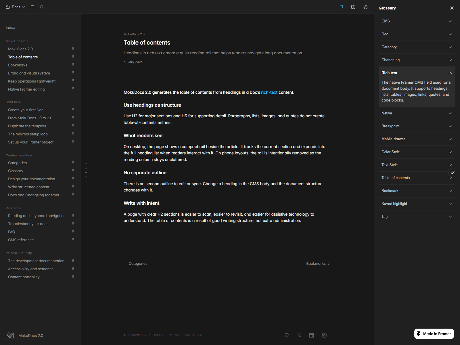
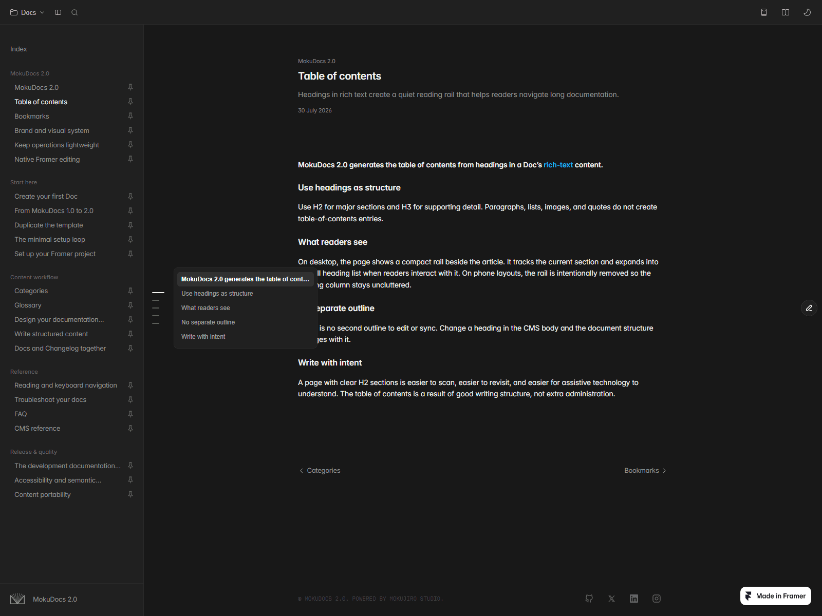
Table of contents. The rail is a column of dashes that takes no layout width until the reader needs it. It expands on hover and tracks the active section while scrolling, so it's always clear where you are in a long document.
Bookmarks. Save a doc and the state persists across visits, so nobody has to re-find a page they already found once.

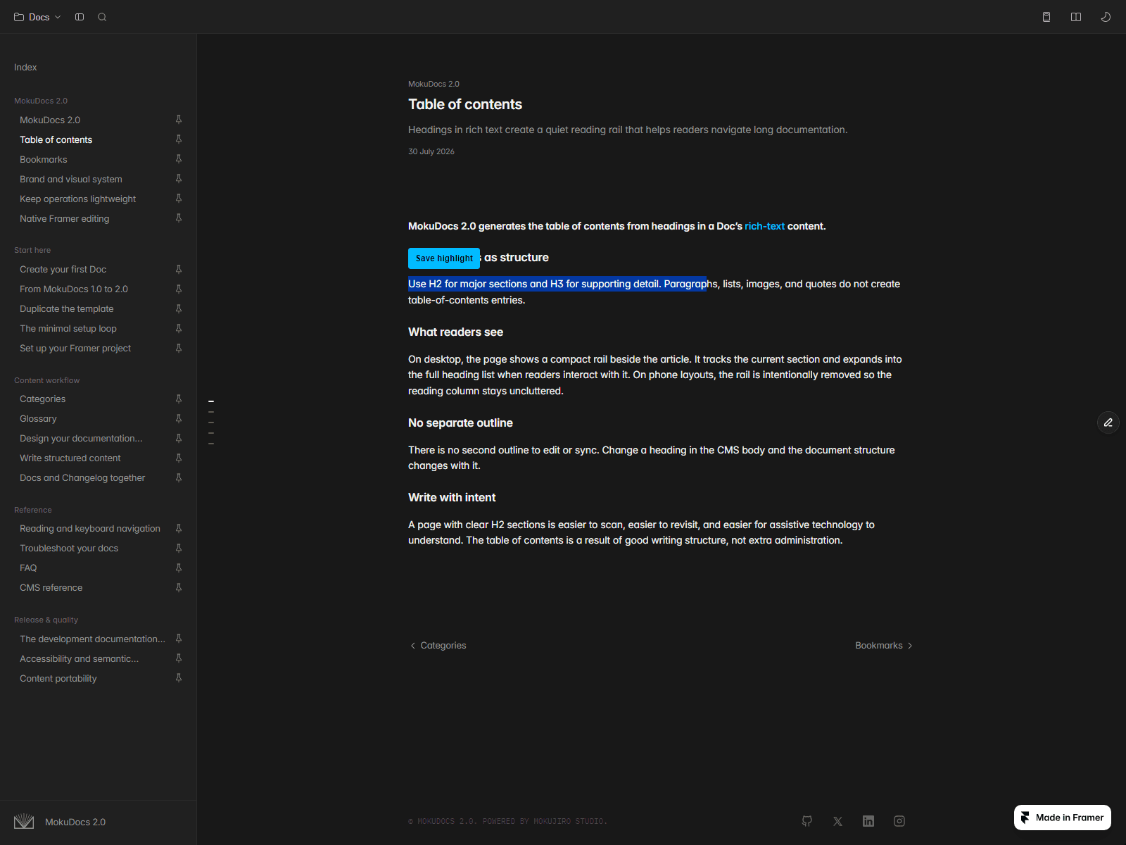
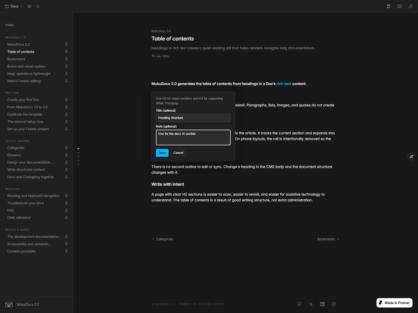
Saved highlights. Select any passage of text, save it with a title and a note. Highlights persist across reloads and navigation, and are listed in a dedicated panel with jump-to-highlight navigation, editing, and undo. This is the feature that treats a documentation site less like a brochure and more like a working document.
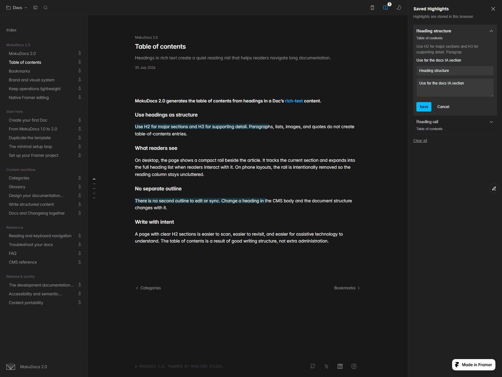
All four features make the same argument. A documentation reader isn't browsing, they're in the middle of a task, checking something against work that's already open in another window. Each of these features exists to protect their place. They're working well when the reader stops noticing them.
Decision 3: Theming that maintains itself
Light and dark themes are generated at runtime, directly from the site's own published Framer colour definitions. There's no parallel dark palette sitting in a separate panel, waiting to fall out of sync with the light one.
Change a Color Style once and both themes follow.
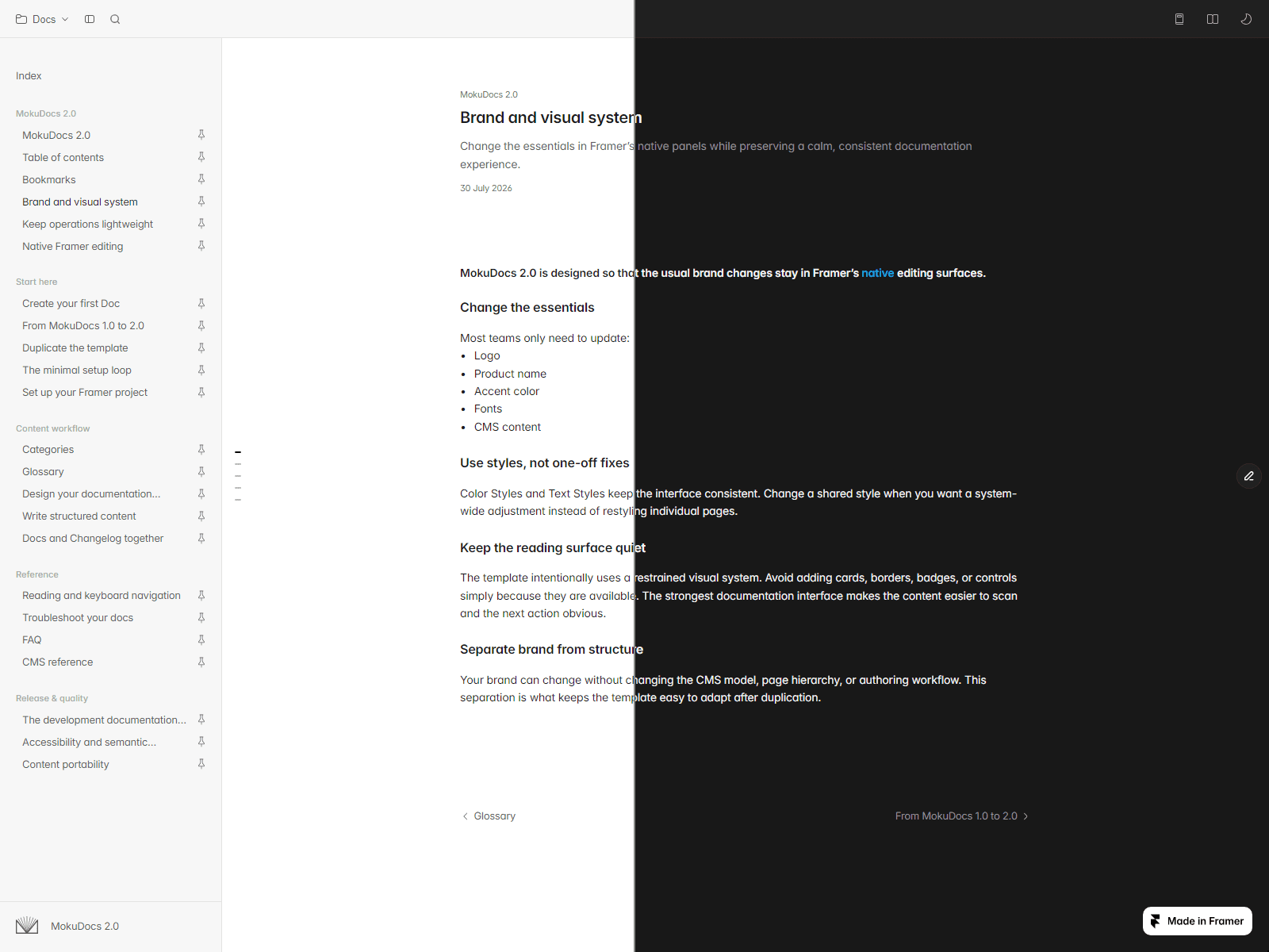
Most theming systems ask the buyer to maintain two versions of every colour decision, one for light and one for dark, and rely on them remembering to update both when a brand colour shifts. That habit rarely holds, and dark mode quietly rots while light mode gets all the attention.
The restraint is deliberate. The real feature isn't the toggle, it's the maintenance the buyer never has to do again. They change one colour and move on, without treating light and dark as two problems to solve twice.
Outcome
4 pages · 4 CMS collections · 9 code components · WCAG AA contrast · dedicated phone layouts.
Accessibility was part of the design brief, not a pass at the end: semantic header, nav, and main landmarks, full keyboard navigation, a skip-to-content link, and colour contrast checked across every page.
The build answered the question it started with. A documentation template doesn't need more pages to feel complete, it needs to protect the reader's place and the things they've already found. Four collections, nine code components, and a set of decisions about what the interface should never ask a reader to redo.
MokuDocs 2.0 on the Framer Marketplace ↗
Work with the studio
Designing a product that needs this kind of thinking?
MokuDocs 2.0
Rebuilt the documentation template around the reading experience, entirely on native Framer CMS
Field | Detail |
|---|---|
Product | MokuDocs 2.0 |
Type | Product design, documentation template |
Scope | Product design, CMS architecture, component engineering, accessibility |
Platform | Framer |
Marketplace | |
Timeline | July 2026 |
Studio | Mokujiro Studio |
Location | Melbourne, Australia |
Designer / Engineer | Ken Tai |
Make the Invisible Visible: good documentation design is invisible. The reader only sees the answer.
The problem
MokuDocs 1.0 shipped on the Framer Marketplace with a full feature set: sidebar navigation, search, a table of contents, bookmarks, reading progress. It worked, and it sold. Living with it clarified what a documentation template actually has to do.
For the team writing docs, it has to be easy to maintain alongside development. Documentation and the changelog belong in the same project, so recording a release and updating the docs happen in one loop.
For readers, it has to protect focus. Reading happens on the page, in one interface, with nothing pulling them away.
The rebuild started there: what would a docs template look like if the reading experience, not the feature count, was the product? Someone arriving at documentation is already mid-task. They want one answer, then they want to get back to work.
Decision 1: Everything on native CMS
Four CMS collections drive the entire site: Categories, Docs, Changelog, and Glossary. Docs items carry a title, description, a category reference, formatted-text content, and an updated date. Changelog entries carry a version, title, date, and formatted-text content, with tag filtering on the published page.
There are no external services and no plugins bridging content into Framer. Every field lives inside Framer's own collections, which means the buyer edits documentation the same way they edit the rest of their site: open the CMS panel, update the field, publish. There's no second login to manage, and no sync step that can fail quietly.
It sounds like a technical decision, but it shapes the whole ownership experience. A docs site that depends on external tooling adds a maintenance job on top of the writing job, and another integration that can break without warning. Keeping everything native means the content lives where the site lives, for as long as the buyer keeps it.
Decision 2: Design the reading, not the pages
This is where most of the design effort went.
Inline glossary. Any glossary term mentioned inside a doc becomes a clickable link. Click it, and a side panel opens with the definition, so the reader never leaves the page or loses their scroll position hunting for a definition somewhere else.
Table of contents. The rail is a column of dashes that takes no layout width until the reader needs it. It expands on hover and tracks the active section while scrolling, so it's always clear where you are in a long document.
Bookmarks. Save a doc and the state persists across visits, so nobody has to re-find a page they already found once.
Saved highlights. Select any passage of text, save it with a title and a note. Highlights persist across reloads and navigation, and are listed in a dedicated panel with jump-to-highlight navigation, editing, and undo. This is the feature that treats a documentation site less like a brochure and more like a working document.
All four features make the same argument. A documentation reader isn't browsing, they're in the middle of a task, checking something against work that's already open in another window. Each of these features exists to protect their place. They're working well when the reader stops noticing them.
Decision 3: Theming that maintains itself
Light and dark themes are generated at runtime, directly from the site's own published Framer colour definitions. There's no parallel dark palette sitting in a separate panel, waiting to fall out of sync with the light one.
Change a Color Style once and both themes follow.
Most theming systems ask the buyer to maintain two versions of every colour decision, one for light and one for dark, and rely on them remembering to update both when a brand colour shifts. That habit rarely holds, and dark mode quietly rots while light mode gets all the attention.
The restraint is deliberate. The real feature isn't the toggle, it's the maintenance the buyer never has to do again. They change one colour and move on, without treating light and dark as two problems to solve twice.
Outcome
4 pages · 4 CMS collections · 9 code components · WCAG AA contrast · dedicated phone layouts.
Accessibility was part of the design brief, not a pass at the end: semantic header, nav, and main landmarks, full keyboard navigation, a skip-to-content link, and colour contrast checked across every page.
The build answered the question it started with. A documentation template doesn't need more pages to feel complete, it needs to protect the reader's place and the things they've already found. Four collections, nine code components, and a set of decisions about what the interface should never ask a reader to redo.
MokuDocs 2.0 on the Framer Marketplace ↗
Work with the studio
Designing a product that needs this kind of thinking?
Case study walkthroughs available upon request.
Case study walkthroughs available upon request.
© 2026 Mokujiro Studio
© 2026 Mokujiro Studio